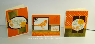
Welcome to the February Blog Hop. Today we are featuring
"All about Color"
If you have just come from Corina Mitchell's blog you are on the right track.
I think this has to be my favorite Color Combination: Olive, Goldrush, Honey, Cocoa and Colonial White. When you work with 4 or 5 colors, you want to make sure your color is balanced with one or 2 main colors and the others are just accent colors. What I mean is make one color your main color…in this case Goldrush is my main color so I want the biggest proportion that color or about 50% that color. Next is Honey…which is about 25% that color. Next is Cocoa and Colonial White which is about 10% each and then we add in the Olive at about 5%. What you want to avoid when working with colors is having the same proportions of each of the color, or equal amounts of all the colors.
All Supplies are from Close To My Heart unless otherwise noted:
Goldrush, Honey, Colonial White and Cocoa Cardstock.
Olive patterned paper from the Lucky Paper Packet X7137B
Honey, Goldrush and Olive Ink
Stamp Sets: Cards Chatter – Sympathy D1476
Sofia B1379
Bitty Clear Sparkles Z1263
Medium Grit sandpaper Z1294
Olive Brads Z1364
Martha Stewart Swirling Lace Punch around the page
Nesties: Scalloped Circles, Scalloped ovals and Petite Ovals small
Cuttlebug Swiss Dots Embossing Folder
Tim Holtz Checkerboard Large Embossing folder
Now it is time to hop on over to Adeline Brill's blog here
Thanks for stopping by...
Laurie


wow I love these colours. goldrush has been my go-to autumn colour since it's been part of the 60 colours.
ReplyDeleteYour cards are just beautiful, you certainly know how to combine multiple colour palettes.
thanks for showing us this combo.
I have to say these are definitely not colors I would choose but your cards are beautiful! Thank you for the explanation of using multiple colors.
ReplyDeletethose colors work great together. you chose a great palette
ReplyDeleteHi Laurie,
ReplyDeleteWOW you really did create a beautiful card using those colors. I would have not been able to do that.
Beautiful cards! They aren't "my" colors but they are gorgeous! Thanks for reminding us about the importance of proportion, AKA the "gallon-quart-pint" rule.
ReplyDeleteThese are great cards! What a fun color combination. This is a beautiful stamp set, and your card layouts are really great!
ReplyDeletebeautiful color combo
ReplyDeleteBeautiful card, and a great tip about proportions.
ReplyDelete